0:40:22
We're all becoming reviewers (maybe we already were) with Jacob Walls
Published April 15, 2026
Djangonaut Space 2026
This video is from Djangonaut Space 2026 .
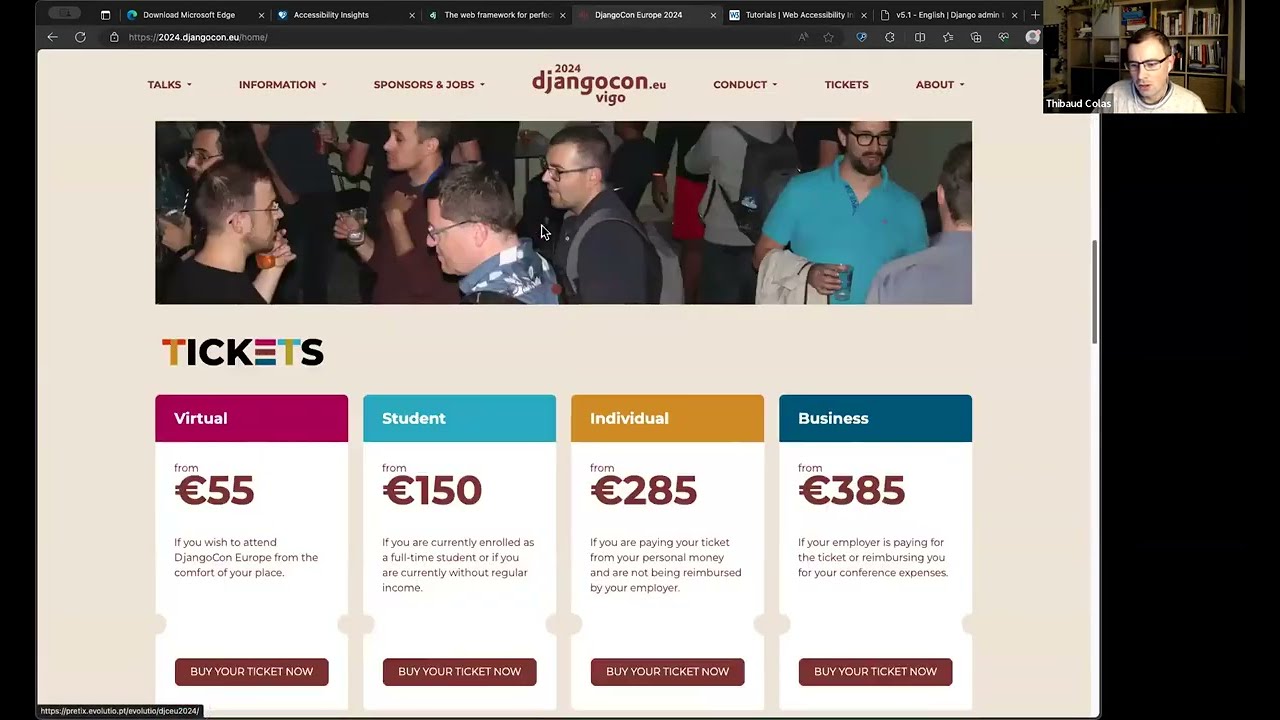
40 minutes of accessibility testing training for Djangonaut Space participants, with a particular focus on common issues in the Django web.
Accessibility should be built into websites so people can use them in different ways, including with keyboards, screen readers, and operating-system accessibility settings. Automated checks with Axe can catch issues such as low color contrast, but they cover only a portion of accessibility problems, so manual testing is also needed. Keyboard testing can reveal missing skip links, unclear focus indicators, awkward tab order, and controls that cannot be reached or exited; Windows forced-colors mode and macOS VoiceOver can expose further problems with visual distinctions, semantics, links, and heading structure.
Summarised automatically from the transcript.
Automatically transcribed, so expect mistakes in names and technical terms.
Speaker 1: Who here is keen to follow along on their own computer? And maybe you can raise your hand or use one of their emoji reactions if just just for me to know who's following along on the screen share. and who is doing it on on their own computer. I'm doing it on my computer for sure. Okay, maybe it's just me. Okay. So I'll be using Microsoft Edge simply because of all the browsers out there, it's the one that in my opinion has the best options built in for XVD testing. You can do XCT testing in any browser, just to be clear. It just happens to be one that I know has quite good options across both Mac, Linux, and Windows.
Speaker 1: And among those options when I say built-in, I should clarify this browser has my favorite extension called Accessibility Insights. You can do accessibility testing without any extensions, but I definitely think this specific one is a good place to start. And it also has built-in tools like a little reader mode. So if I go to a page of the Django websites. In my browser URL bar, I have this little icon called Immersive Reader that creates this new custom style that's meant to be much more readable. of the page I was on and also has the option to read aloud the page content. So kind of like a mini screen reader, which is a type of
Speaker 1: um tool that people use to navigate the web kind of like a mini screen reader built into the browser which is really cool so yes Microsoft Edge good And if you're looking for a place to start, I definitely think it's a solid one, though there are options like this in most browsers, most operating systems. It's just they differ quite a bit. So I thought we'd dive quite quite soon right into the meat and potatoes of activity testing, but maybe a word about activity testing first of all. Why do we do this? It's really simple. Accessibility, the idea of making web content more usable by people who otherwise might be left out. It's really fundamental in my opinion to how we build sites and apps.
Speaker 1: We use technologies like HTML. because we want people to have uh an easy time accessing the things we build, no matter their device. You know, it's this whole idea of If you're on the phone, if you're on your fridge, if you're on your car, maybe you can access just the same website and look at the information and your your browser translates the code into something that works on your device. So I think in some respects accessibility is kind of uh an extension to that. Um, the idea that it's not just for kind of what we think by default is uh people who are cited on a on a desktop device with a mouse. It's not just for those users. It's for anyone who accesses websites and apps no matter how.
Speaker 1: So today we'll look specifically at uh how people use keyboards, for example, to navigate the web. And when I say use keyboards, I mean keyboard only, no mouse. and we look at other types of access as well. So people will choose which way to access the websites based on their specific needs. Sometimes we use the term activity needs. Sometimes it's people who are disabled. Maybe they have like a specific condition from birth. Maybe they just got into an accident at some point in their life Maybe they also just uh have a have a condition that's temporary, like maybe they're holding something, maybe they broke their arm and it's in the cast. So it's not necessarily people who
Speaker 1: like you think as like handicapped, disabled, forever. It's like lots of different people who have no specific access needs and that we want to cater for. And for example, me, something as simple as wearing glasses, I obviously have quite a clear need for the things I read on my browser to be readable. And yes, sometimes it's also visibilities you can't see at all. If someone is colorblind, you'll have no idea. And obviously the We want websites to work like regardless of someone's condition. So yeah, when we go to activity testing, unless you have those conditions yourself. We usually tend to think rather than conditions about which specific techniques or tools people use to navigate through the sites.
Speaker 1: So we talk about assistive technologies to be very specific. technologies that you use to assist uh assist the user in navigating the web. So again, keyboard only, that's kind of considered an access technology. screen readers are another type, speech recognition software, etc. etc. Um, but I guess as beginners it's important to understand that You can't and probably never will be able to test a site exactly the same way that someone that's been using those technologies for a while will be able to. But it's nonetheless good that you're able to do some amount of checking. And definitely if you wanna become a specialist in this type of testing. you can pick up yeah using a screen reader for example or or any
Speaker 1: on any other type of tech really. So With this out of the way, we'll go straight to the testing and I'll start with a few quick tips. Just a few more words of order. You can definitely interrupt me at any point in time. There should be a feature in Zoom for you to say like raise your hand that I can't spot right now. Reactions. So hopefully inside reactions you'll have a raise hand button that I should be able to see on my screen. If I don't see it for whatever reason, do feel free to just uh Turn on your microphone and say so out loud, that's completely fine. And uh yeah, make sure there is time for questions as well, hopefully during and at the end of
Speaker 1: this as well Anyone have questions before before we move on? Okay. I'll take that as a no. Thank you, Ellie. I can't see everyone for some reason. I can only see Three, five people. I need to learn better how to use Zoom. Hopefully you can signal it to me if I'm missing someone else's question or raise hand. Yes, so accessibility testing on the web, I thought we start with uh a site that we all know a bit and where some of us will already be well aware that there are lots of possible issues, just to get a sense of when you approach a new project, where exactly to start.
Speaker 1: So I mentioned we're in Edge and Accessibility Insights because I believe it has good built-in tools and we'll start with the extension I mentioned earlier called Accessibility Insights. You might have heard of similar extensions in the past. The reason I recommend this specific one is that it has a lot of things all combined under one roof. So just at this point, can I get a show of hands that you can definitely see the activity insights panel in my browser? Yes, great. I'm always concerned with those things because overlays on overlays can be a bit tricky. So this panel You won't get to see it right away when you start the extension. You'll first see this other launchpad panel with four different types of tests.
Speaker 1: That's why like this extension is kind of all inclusive in one package. And what I really like in particular is this ad hoc tools area at the very bottom where I have all those little toggles that are different types of testing. So automated checks is always, always a good place to start. This extension bundles an activity testing engine called Axe. You might have heard about Axe before, it's really popular. I think it's the most popular open source testing engine from folks at a company called DECU. And so AX, the only thing it does is those kinds of automated tests. pass fail that you get to run basically at the press of a button and it tells you exactly where on the page the error might be and what the error is.
Speaker 1: Can someone guess what the error might be in this top left red area here?
Speaker 2: I'm guessing the contrast
Speaker 1: Yes. Yes, definitely. So one of the many things that Axe is able to check in at least some occasions is the color contrast between the text and the background, which according to Axility best practices has to be a certain amount. So in this case it tells you, oh, ensure the contrast, blah blah blah blah. This is the specific rule name that the tool is using here. This is the element, and then here is more details about the issue and how to fix it. And um If you want to report an accessibility issue on someone else's project, you can take a screenshot of this. That's a really great place to start. You can also copy those details so that it's a bit more accessible Or you can do copy failure details file issue.
Speaker 1: It has quite good integration with GitHub, for example. Let's look a bit further down the page. Can anyone tell me what the issue might be? Yeah , bottom rights Well I'll faster. Yes. Yes, it is. So that's uh I was at the point to point this out specifically because of I guess how commonplace those issues are in in Django We're really liking designers uh in the Django contributor universe for some reason. So those issues are very prevalent.
Speaker 1: What's interesting for me to notice is uh the types of errors reported here, they can be quite uh What's the term? There aren't that many variations in what Axe reports. So something we'll notice quite quickly is Axe misses lots of things The reason it does miss so many things, as we'll find out with more manual testing, is that Axe only reports things that can be checked automatically. And if we look at all possible issues out there, things that you can test with automated checks, that's only about 30 to at most 50% of possible issues. So that's why we'll have to learn about all the other panels here and also about lots of other manual testing techniques.
Speaker 1: So a specific thing, for example, that Axe doesn't check for is keyboard support. Let's do a bit of keyboard support testing together. I think it's a really good exercise if you have the chance now and then to try and use something you built or a tool that you use quite often with just a keyboard and see how far you can make it through. So for example, in the case of Django, we could try and make a donation with the keyboard only and see if that's possible or not. Or we could try to say read the latest blog post or download Django, for example. So download Django is one of my favorites because it allows me to demonstrate quite a few points in one go. So we'll go through that now. And just to make it a bit more visual
Speaker 1: actually be testing the keyboard supports with a bit of a help from my extension. I'll be using this tab stops tool. And the only thing this Tab Stops does is it illustrates as I navigate through the page with the keyboard where exactly my keyboard focus has been. So it traces this path of how I navigate through the items one after the other. So just to be clear, all I'm doing here is pressing the type key on my keyboard to go through the page. and check what might be the ideal path versus the actual path. Can anyone spot an issue already right there?
Speaker 1: There is quite a few, I'll be completely honest. The first one I started right away is something that's missing completely from here is a component we call a skip link. So you might have heard of skip links before. It's a technique to make websites more accessible And what a skip link does, plain and simple, is allow you when you reach the page first to skip going through all of the navigation elements one by one in the main navigation menu of the page. You can imagine most sites out there, they have navigation menus these days. It can be pretty frustrating if as a keyboard user I had to go through the navigation menus each and every single time I go through a page That's the point of skip links. I meant to take you straight from arriving on the page to the actual content and it's missing here.
Speaker 1: Can anyone spot another issue? My focus has reached this middle area here Sarah, I'm pretty sure you've seen this one before. Or maybe you haven't. Okay. So what
Speaker 2: with the issue
Speaker 1: The issue we're facing here is we reach this button, but it's honestly not that clear at all to me that our keyboard focus is currently on that button. Um It's really subtle to be polite and like between those two buttons, I can't really tell if there's one that's focused and not the other one. So definitely a problem we've had already in quite a few buttons at the top here It's not really necessarily that clear where the focus is. And these days, with accessibility guidelines, there's actually quite clear rules on how big the focus indicator has to be It has to be at least one pixel on each side or if it's only on some sides then it has to be like the same amount. So four pixels total if it was on all sides
Speaker 1: It's on the single side, it has to be four pixels in the one side. It's on two sides, two pixels each. But honestly, day to day, there's no reason to use any other focus indicator than one that's either custom and at least two pixels thick or just a built-in one in the browser. And we're doing neither here. We have those custom focused styles that are just not visible enough. And so as I go through the rest of the page, I'll see other occurrences of this issue. But something that I'll also see that's quite annoying in my opinion is this two-column layout that's causing me as a screen reader, sorry, as a keyboard user. to have to go all the way down this page and then back up to reach this download area. So that's the kind of thing if you force yourself to use the keyboard only, you'll notice quite quickly
Speaker 1: when Either something isn't working at all or just the path could be much faster. But just to give you an example, if I now switch very quickly to the Django admin. And I'm on my test project. I'll just go to a simpler page for now. I have this page right here where I have the Django debug toolbar in the top right It is plain and simple, impossible to get to the Django debug toolbar with the keyboard. And that's the type of thing where once you've noticed it, there's no unnoticing it. And um this would be as simple as switching this elements, uh this Django debug toolbar
Speaker 1: toggle elements to be a button. So definitely a simple fix once you're aware of the need for this keyboard support and uh the techniques to achieve it. So back to our Django Project. com websites. We'll do a bit more keyboard testing and again I'll go through the top area quite quickly so you can see possible issues. You'll notice right here the focus styles only overview button again with the issues I mentioned earlier, the lack of complete outline around the button. And the fact that the text of the button as well isn't necessarily that well highlighted in these focus styles. So clearly some room for improvement here.
Speaker 1: And also do something quite fun. We notice we have different styles of focus indicators here. So Again, probably something we should try and not do, which is having different styles per per element like this. If I reload the browser and switch to this dark mode version. I'll notice that in some occasions, no, I've lost it. In some occasions I can't find anymore, the focus stats are completely hidden. Yeah, so this Django button in the top left. For some reason in dark mode has different focus styles yet again, which are almost impossible to see. So we'd be much better off with just the browser's default ones which should work well in both dark and light mode.
Speaker 1: Anyone have questions about this so far?
Speaker 3: Me
Speaker 1: Yes.
Speaker 3: Uh I know the answer, but anyway, it's for more for people. Um You you you use the keyboard to to start from to start from the top uh to the bottom but Alf how do we do like the reverse way?
Speaker 1: Oh yes, so that's a good question. So as far as testing with our keyboard support, like definitely the best place to start is just tab, tab, tab, tab, tab on your keyboard And then at some point through the page, you might have to press the spacebar or the enter key to maybe interact with the form, for example. So could sign myself up for a mailing list with the enter button um but aside from those three keys that's basically it Except if for some reason you were supposed to try tabbing yourself backwards, which is in this case it's shift tab on my Mac. So the exact same process but in reverse order So I think yeah, thank you, Sarah.
Speaker 1: It's a good time for me to I guess to provide you with a bit of an overview of possible keyboard issues. Number one. Is something reachable with the keyboard at all or not? Which we've seen with the debug toolbar. Number two, are focused styles clear enough that you can tell where you are on the page, which we've seen in multiple places here. Number three, the ideal versus I guess actual path of the tab stops, which we've seen with the download button. So just as a reminder, going all the way down and then back up, that's quite annoying. So that's that's quite a few issues so far. And under even further issues that I might not be able to demo today.
Speaker 1: Like for example, you might have a case where there's a model window that opens in the page that you might not be able to exit anymore. Or maybe there is a specific component on the site like An embedded map, for example, is a is a common issue. Can I find an embedded map on these websites? There is one somewhere but I lost it. So uh just find you a better better example even. So This page here has a PDF reader. These kinds of fancy components, they can occasionally trap keyboard focus in a way that people aren't able to get back down
Speaker 1: to the page after this, it can be quite problematic. So reachability, does it support keyboard access at all? Focus styles, tab order. keyboard traps and I think that's a good amount of possible issues to be aware of with the keyboards. Any other questions folks? Okay, so keyboard definitely something that you should be able to do on pretty much any product you work on without much more knowledge than what we've been through already. Definitely there is no special tooling needed, but things like this tap-stop extension can kind of help you quantify the scale of the problem when there is one.
Speaker 1: We'll look at something else next, and I want to try something that's outside of this extension just to give you a good breadth of experience with assistive tech. We're gonna look at one of my favorite Windows features which is called Windows High Contrast Mode So we're gonna look at it on um the Django admin, because we'll be able to find loads of tickets this way. And don't we all love finding loads of tickets, aka bugs? So I'm on my Django admin page. I'm gonna switch to the light mode for a second. Can you all see the browser developer tools to the right of the
Speaker 1: great? Thank you. So in there, don't know how well you know the Microsoft Edge browser developer tools or the ones in your browser. If I Find just the right panel called rendering and navigate to just the right place called Emulate CSS Media feature force colors, I'll be able to emulate a feature of Windows, which is called contrast themes or high contrast mode. If you haven't heard of this feature before, it might sound like quite a big word, it's really simple. It's just this idea that when you turn this on in Windows.
Speaker 1: The operating system takes control of quite a few of the styles of web pages and apps on your desktop. And it's really that simple. It just takes over some of the styles with the goal of making web content. and desktop apps, web apps, all the same, making them higher contrast or at least more readable, or could also say just customized to your needs more than the website's styling needs So we're looking at the same HTML page as before. It has the exact same CSS loaded, but this CSS has been partly overridden to, for example, disable all of the background colors. uh disable lots of the text colors as well so that they all use those kinds of
Speaker 1: much more visible much more semantic colors in the different places So it's really as simple as knowing where the switch is in the DevTools and turning it on and off to try out with these Windows features. And it works, I think, 99%, just like what you see in Windows, in your Windows settings, which is really cool to have access to other browser feature, other operating systems. You can also find it by the way with the command palettes in the DevTools. So even if I was back on my console, for example, in my OS, I can press Command Shift P and just type forced colors and say turn it off
Speaker 1: turn it on just like that without having to go hunt for it it's really helpful And this feature I've been told was used by like 15% of users are are there, like something really crazy, crazy like that, which I don't really believe because it seems way too high. But considering it's a built-in feature of Windows, which is one of the most popular operating systems out there, I definitely believe that there is millions of people out there who use this specific feature And again, like there's not much to learn from them, it's just on and off. And they get access to websites that are much more, I guess, high contrast generally and much more usable for them. So Loads of things we can do to improve support for this specific type of
Speaker 1: technology. One of the first things we can do that's really simple is just in this one mode without the background colors. It can get quite tricky to know exactly which area of the page you're looking at. So that's why particularly for flatter websites, it can be really useful to add extra borders. So for example, can someone spot an element that might benefit from an extra border in this forced colors mode?
Speaker 4: I'd say the buttons or Yeah, I'm gonna start with the buttons.
Speaker 1: Yeah, exactly. So buttons in the top right here can definitely tell that they are here based on the label, but it does look a bit I guess funky that there'd be text floating around like this. Someone who's used to this theme, they'll know anyway that something that has yellow text is a link, not a button. But you probably nonetheless give them some good indication. And for things that are definitely HTML button elements. For some reason, First Colors mode decides to give them the same text color as any other text in the bottom area here. Alright, definitely feel like it would be much clearer these are three separate buttons if we had the background color.
Speaker 1: So it's really as simple as either adding a transparent border all the time to those buttons and then in force color mode will automatically make it a high VS color Or using a bit of CSS Media Queries to say, specifically in force colors mode, please add borders to those elements It's really, really simple stuff. And uh yeah, it's a treasure trove of tickets for Django because those issues are just all over the place You might have picked up on something else I mentioned, which is oh links versus buttons. Can anyone spot something on here that might be meant to be one or the other and is the wrong thing?
Speaker 1: In this bottom area of the form maybe you'll spot something that's a problem.
Speaker 2: Is the show of the advanced options a button or a link?
Speaker 1: Uh-huh. Well. What do you think? Text is yellow, right? So it's a link. So yes, it's definitely something that's if we inspect the HTML probably is a link element, but I would guess has been yeah, it's an href equals hash, which means someone who thought only A elements should be used at its own JavaScript to turn this into a button. So this is definitely something that should semantically be a button, acts as a button, and just happens to really look like a link. So not necessarily like exactly that this is a wrong wrong thing to do. Like maybe there is some reasons out there why it's appropriate.
Speaker 1: But definitely it will be much clearer to people who use this type of interface if something that works like a button looks like a button. And there's probably something for it to be said that it should be the case regardless of whether you used forced colors mode or not. Maybe if this is just a toggle thing. Maybe we can just use an icon that's used for toggling or maybe having something that's more like visually represents a button rather than text inside parentheses So yes, and once we have this open notice as well, we kind of lose the border around the item, which would definitely be nice to keep to have a sense of what's inside or outside of this toggle section. So again, like don't
Speaker 1: say something that prevents you from using Django, but definitely something that is quite a nice improvement and just makes it much less confusing which area of the page you're looking at if you have those things styled. according to this um forced colors mode. There's lots more to say about this, but I think I'd rather show you some other techniques. But before I move on, does anyone have questions about this? No. Okay. So we're gonna how much time do we have left? We have 10 minutes. We're gonna spend a bit of time with screen readers because it is honestly really cool once you get to learn it, but also quite daunting to get started.
Speaker 1: Who here has A Mac. Yeah, I see two hands. Oh my gosh. Three, four, five? Wow, okay. Great. So that's the one thing that's really annoying with screen readers is that each operating system has a different one. Which means you can only really learn the ones that are available to you as a user of said operating system. So definitely if you get into activity testing professionally It's really great to have access to services that solve this issue, but at least as beginners at the beginning, it can be quite tricky to, I guess, just have access to different operating systems
Speaker 1: just for testing purposes. But on macOS we're quite lucky because we have one that's built in that's called voiceover And um VoiceOffer, as far as screeners go, is definitely not perfect. It could be better, but it does have the advantage of being a built-in feature of its operating system. which means that Apple has taken quite good care to make sure that it works well with um with the OS. What it means for us though is um rightly or not Voiceover works much better with Safari than with any other browser. So we'll have to switch to Safari to use voiceover because that's what That's what we have to do, I guess, to support the web.
Speaker 1: Definitely people out there who use voiceover They might just feel more comfortable with Safari because they know that it's the same people behind the browser and behind the screen reader, so they just have more trust in it. Doesn't necessarily mean that voiceover is completely broken in other browsers. But it works best with Safari. So people tend to use Safari. So we test mainly with Safari. So I'm now looking at the DjangoCon Europe website in Safari and I'll get voiceover started.
Speaker 5: Voiceover on Safari. Sponsorship. DjangoCon Europe 2.
Speaker 1: I forgot to check ahead of time. Were you able to hear this or not? Okay, great. So I'll just warn you it can be really annoying after not too much time to have your computer speak at you all the time. Can you see this little window in the bottom of my screen as well? Great. Just to warn you as well, the reason I ask is screen sharing of screen readers can be quite tricky and you never know exactly which program captures which part of the screen. Can you see
Speaker 5: links menu
Speaker 1: this links panel? Great, we'll get to teach everything then. So we'll step back a few
Speaker 5: closing. Voiceover off.
Speaker 1: Turn off voiceover. How do you get voiceover started? Really simple. It's one keyboard shortcut away, which is command f5.
Speaker 5: Voiceover on Safari.
Speaker 1: And as soon as voiceover starts, it starts announcing the content that it's accessing. And it shows this little um, I think it's called announcement log which gives you a visual representation of what it's reading at the moment, which is really helpful for people like us who can see their screen. If you were blind, obviously you wouldn't be able to see this But something that's really important to know is lots of people who use screen readers actually aren't fully blind and they might actually be able to both look at the page and benefit from the uh voice announcements at the same time. So those types of features definitely help them. So we have this proof right away. VoiceOver starts talking right away and the very first shortcut you learn is how to stop it from talking any further.
Speaker 1: Because it can be really aggravating, which is the control key. So as simple as whenever you want to stop, you hit control.
Speaker 5: Sponsorship. DjangoCon Europe took a few.
Speaker 1: And whenever you want it to resume, you can also hit control and we'll just go through all of the information it has about the specific elements it's on at the moment You might have noticed as well when I got it started that it showed this little outline around the talks element. Just to be very clear, this is not my keyboard focus outline. This is a separate cursor or focus indicator of the screen reader itself. What's really popular, what's really cool about this is that this specific, I guess, screen reader pointer or focus indicator, I can take it over any element of the page regardless of whether it's interactive or not. So I can take it to one of the headings for example.
Speaker 1: I'll do that now.
Speaker 5: Information. Sponsors and jobs. Collect link image. Heading level one. Sponsorships
Speaker 1: So even though this hiding element isn't interactive, doesn't support keyboard focus, the screen reader, just like any other screen reader out there, is able to take its screen reader focus over here And you'll notice as well that my keyboard focus stopped over the tickets link at the same time for some reason. So they are very separate things. Just like someone who uses both a mouse and a keyboard will have a different mouse pointer and keyboard focus. It's the same concept here. So it's really important to be aware of this, which is that screen the users they can navigate the page with their keyboards navigation, just the same, tab, tab, tab, back up and down. But they can also navigate all of the elements with this special navigation mode, which takes them through all of the elements one by one.
Speaker 1: And they even have other options in specific scenarios. So just worth being aware that there's all those ways to navigate the pages even with just the one kind of screen reader tool category. So what I've done here is I've used keyboard shortcaster navigates up and down the HTML elements hierarchy that are specific to voiceover. I will not teach those shortcuts today because they are really tedious to learn but I can send you a link to a page that explains them later. But essentially it's a combination of what VoiceOver calls modifier keys to say I'm in navigation mode and then just the arrows up, down, left, right. What I'll show you however is
Speaker 5: links menu
Speaker 1: this panel which we call the rotor in voiceover. So this is specific to voiceover and it's really cool because it allows you to test lots of things like a screen user would use them without having to learn all those shortcuts. So this panel called the rotor, you can get it opened with control alt u letter U on my OS. And once you have this, it allows you to navigate through the page via specific panels like links, headings menu, headings I need to move off to the side because for some reason it's decided.
Speaker 5: Heading level one. Sponsorships.
Speaker 1: It was better off to the side.
Speaker 5: Headings menu. Zoom
Speaker 1: us, zoom, safari, spot
Speaker 5: headings menu.
Speaker 1: Okay, we're back in business. So headings.
Speaker 5: Form controls menu.
Speaker 1: Form controls.
Speaker 5: On item four columns. Six
Speaker 1: tables. Don't know what the table is, but we know there's a table.
Speaker 5: Windows spot menu. Links menu.
Speaker 1: And back to the links. So if you've ever wondered why someone was telling you oh link text has to be descriptive of what the link is about without context This is why. This is why we can't do read more links. Because if someone tries to go through the page like this with the links only and no other context. be really hard for them to know what's what if they all just say read more in there. But it's definitely really useful as someone who might have gone through this page before and kind of know what you're looking for. to be able to go straight to the link you're after. Like maybe all I want to do here is follow the conference on And I'd much rather go straight to that specific link I know is in the footer rather than having to go through all of the page
Speaker 1: bit by bit. Um same for headings. We definitely have heard of headings before and why they matter like semantically on the web. That's why we want quite a clear heading hierarchy on websites so that people who use this interface have a really easy time knowing exactly which part of the page they are on and how it relates to other parts of the page. So here You can see that almost all heading levels are level one for some reason, which is not what we want. Ideally it'd be some indication of what the structure of the page here is. And that'd be one heading level one to indicate the top of the page, so to speak. So here it feels to me like this sponsorships heading. should be level one, but both for cited
Speaker 1: users and screwdriver users, probably further sections further down the page should have a Heading
Speaker 5: level one.
Speaker 1: That's a different style visually. That's just like smaller slightly. And that's a different heading level semantically. So loads of ways to test headings, obviously even just looking at the HTML can help you quite a bit. But if you know how to use a screen like voiceover, even if only just to get this funnel opened. Then you can test it like someone will actually reuse it 's really powerful. And I think we have time, so I probably stop there. Though I do have more time to stick around if anyone wants to ask questions But um yeah, I think I'd much rather from then on just go through what people think of this and whether there is specific things you'd like us to test together or whether Um the specific questions you have about testing generally.
Speaker 5: Marriage Glutex to everyone. Https color slash slash. joice overall. io Slash table dash OF dash contents slash I made a bookmaclit for heading levels once and Zoe
Speaker 1: Ah, we got one more one more bit of testing, which is what happens when some other app on the operating system decides its content is more important than what I'm looking at right now So yes, um maybe we could talk about that as well. But yeah, this is officially the end of the allocated time, so I can stick around. But if people want to head off, I'll start the recording now and we can we can take any questions. I'll just leave it there
Accessibility helps make web content usable by people with different abilities, devices, and ways of interacting—not just sighted users on a desktop with a mouse.
Discussed at 1:33Automated tools such as axe can flag issues like insufficient color contrast and point to the affected element. They only catch issues that can be checked automatically—roughly 30–50% of possible accessibility problems—so manual testing is also needed.
Discussed at 10:18Check whether every control is reachable, whether the focus indicator is clear, and whether the tab order follows a sensible path. Also watch for keyboard traps that prevent users from leaving a component.
Discussed at 19:03In Edge DevTools, use the Rendering panel’s “Emulate CSS media feature: forced-colors” setting to turn forced colors on and off. Check whether controls and page sections remain distinguishable, adding borders where needed.
Discussed at 22:07Use VoiceOver’s rotor to browse links and headings separately. This can reveal vague link labels and heading levels that don’t reflect the page’s structure.
Discussed at 36:35Note: We understand that names change, people change, and bodies change. We respect each individual's journey and privacy. If you have any concerns about a video or need us to remove content, please don't hesitate to contact us. We will handle your request with care and promptly address any issues.
Published April 15, 2026

Published April 12, 2026

Published December 5, 2025

Published November 11, 2025
Published October 23, 2025
Published July 12, 2025